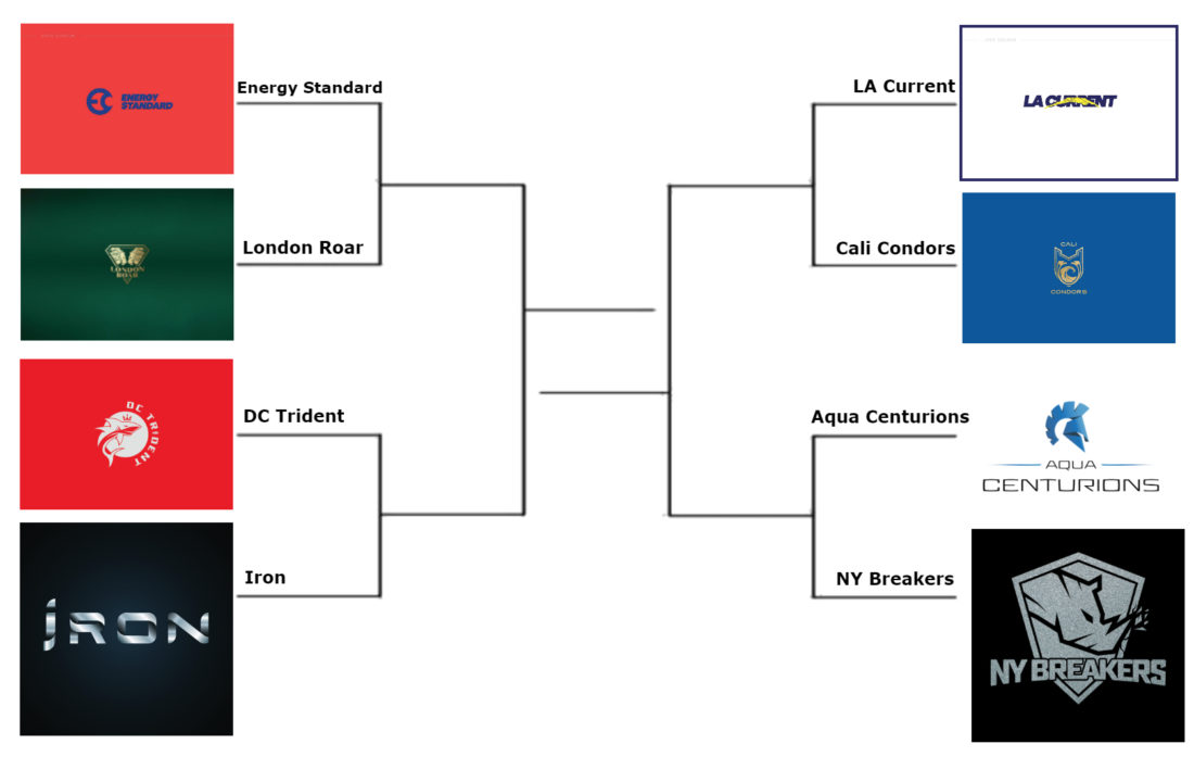
We’ve got official logos for all 8 of the International Swimming League year one franchises, and the only logical thing to do is have them compete head-to-head in a bracket.
We’ll match up the 8 logos in one-on-one polls, letting the fans pick their favorites. The logo with the most votes in each poll will move on to the next round. Our plan is to run round 1 for about a week, with logos moving on to the next poll bracket late next week.
Seeding was determined randomly, as were the matchups. Some franchises have multiple logos, but we tried to determine the main logo for each team.
ISL Logo Bracket
Round 1 Polls
Energy Standard vs London Roar
Which ISL team has the better logo?
- London Roar (90%)
- Energy Standard (10%)
DC Trident vs Iron
Which ISL team has the better logo?
- DC Trident (58%)
- Iron (42%)
LA Current vs Cali Condors
Which ISL team has the better logo?
- Cali Condors (72%)
- LA Current (28%)
Aqua Centurions vs New York Breakers
Which ISL team has the better logo?
- New York Breakers (61%)
- Aqua Centurions (39%)
The International Swimming League is set to begin this fall, featuring 8 inaugural franchises across Europe and the United States. You can find full rosters, updates and other news on our International Swimming League channel here.
Here’s a refresher on the meet schedule:
- Indianapolis, IN, USA – October 4-5
- Naples, Italy, Europe – October 12-13
- Lewisville, TX, USA – October 18-19
- Budapest, Hungary, Europe – October 26-27
- College Park, MD, USA – November 15-16
- London, England, Europe – November 23-24
- Las Vegas, NV, USA – December 20-21
The schedule runs every weekend in October, sometimes on Friday-Saturday and sometimes on Saturday-Sunday. There’s a two-week gap early in November before two more consecutive weekends, and then about a month gap to the league championship in December.
Here’s which teams will compete in each meet:
| GROUP A | GROUP B | DERBIES | FINALS | |
| DATE | October 4-5, 2019 | October 18-19, 2019 | November 15-17, 2019 | December 20-21, 2019 |
| LOCATION | INDIANAPOLIS, IN | LEWISVILLE – DALLAS, TX | WASHINGTON, DC | LAS VEGAS, NV |
| TEAMS | Cali Condors | LA Current | Cali Condors | US Team |
| DC Trident | New York Breakers | DC Trident | US Team | |
| Aqua Centurions | Team Iron | LA Current | European Team | |
| Energy Standard | London Roar | New York Breakers | European Team | |
| DATE | October 12-13, 2019 | October 26-27, 2019 | November 23-24, 2019 | |
| LOCATION | NAPLES, ITALY | BUDAPEST, HUN | LONDON, GBR | |
| TEAMS | Aqua Centurions | Team Iron | Aqua Centurions | |
| Energy Standard | London Roar | Energy Standard | ||
| Cali Condors | LA Current | Team Iron | ||
| DC Trident | New York Breakers | London Roar | ||


Let’s get a philly team
can we get a philly team started???
The Trident looks like a summer league logo.
And the Condors looks luke a soccer team logo.
Cali Condors has the only really beautiful logo in my opinion. London roar is OK. The rest looks like either age-group teams or even worse, company logos (looking at you team IRON’s hardware store and AQUA CENTURIONS/ENERGY STANDARDS/LA CURRENT’s Tech consulting agencies)
Crowd sourced
LA Current logo isn’t bad. DC Trident Logo looks too age grouper-ish. I can’t do any better so I am not one to talk. However I feel like they could have asked talented artists from local teams to submit designs. Many artistic swimmers and swim fans out there that could have designed something with more character.
The Breakers logo looks like a rhino.
The Trident logo is…. a shark?
WTH?
Yeah, I’m seeing a rhino too. Can someone explain to me what it’s really supposed to be?
It’s a Rhino.
It’s “breaking” through, get it?
If they’d lose the weird cement coloring, I think I actually kind of like that one.
If they had extended that styling to the whole league, I think it would’ve been a solid brand.
It is a Rhino. The Rhino, indigenous to South Africa (where Peter and I are from) and in African culture, is a totem for power, agility, and unconventional behavior. We thought this really fit our beliefs as a club and wanted to emphasize especially the latter of those in the symbolism of the Rhino breaking through the shield. They are thick-skinned, fearless, and resilient, and that has symbolized our own personal journey to this point and we really think that it also resembles the character of the athletes we have on our team and want as part of our team.
Wait are you real?
Yes, this is the real Tina Andrew, general manager of the New York Breakers.
The weird thing about the Energy Standard logo is that on the one hand, it only makes sense if you speak Russian (Standard in Cyrillic starts with a C, so it’s like a stylized EC)… but then it still doesn’t make sense in Russian because the E is backwards (since it should be an Э).
Where do u purchase tickets?